How to Create a High Converting Landing Page
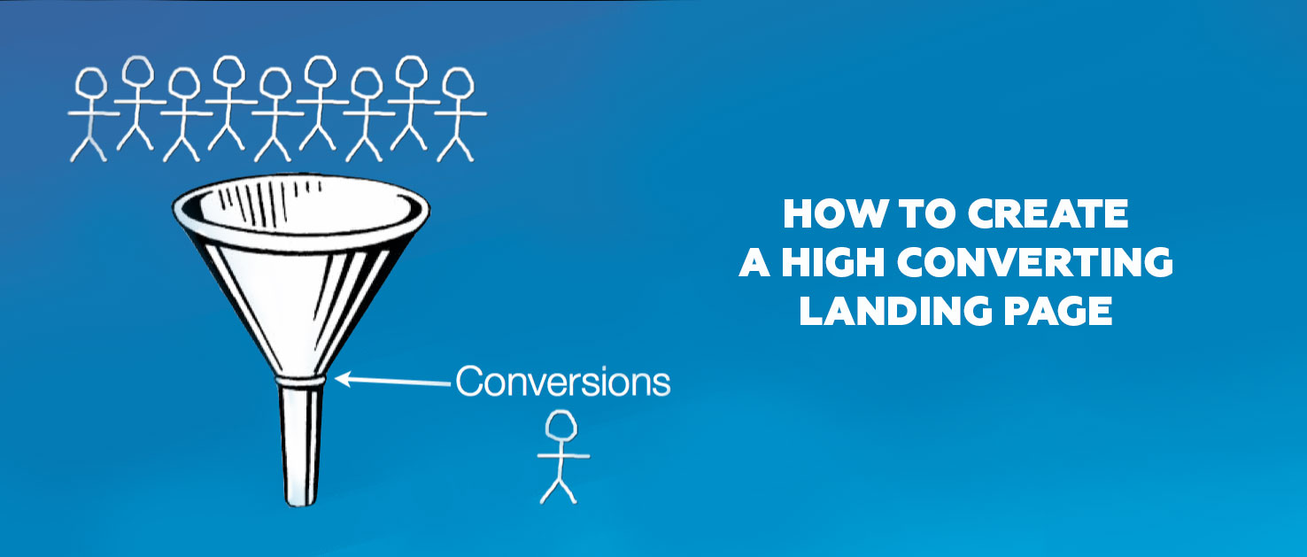
Every webmaster wants the users to fall in love with the product immediately. In other words, you need to create an effective call to action which increases the conversion rate. The final goal is to make a potential customer to turn into a lead and to perform an action (registration, subscription, purchase).
Based on this, we have prepared for you a rating chart how to create an effective landing page that converts.
1) Do not forget that an effective landing page makes a visitor to act like you want
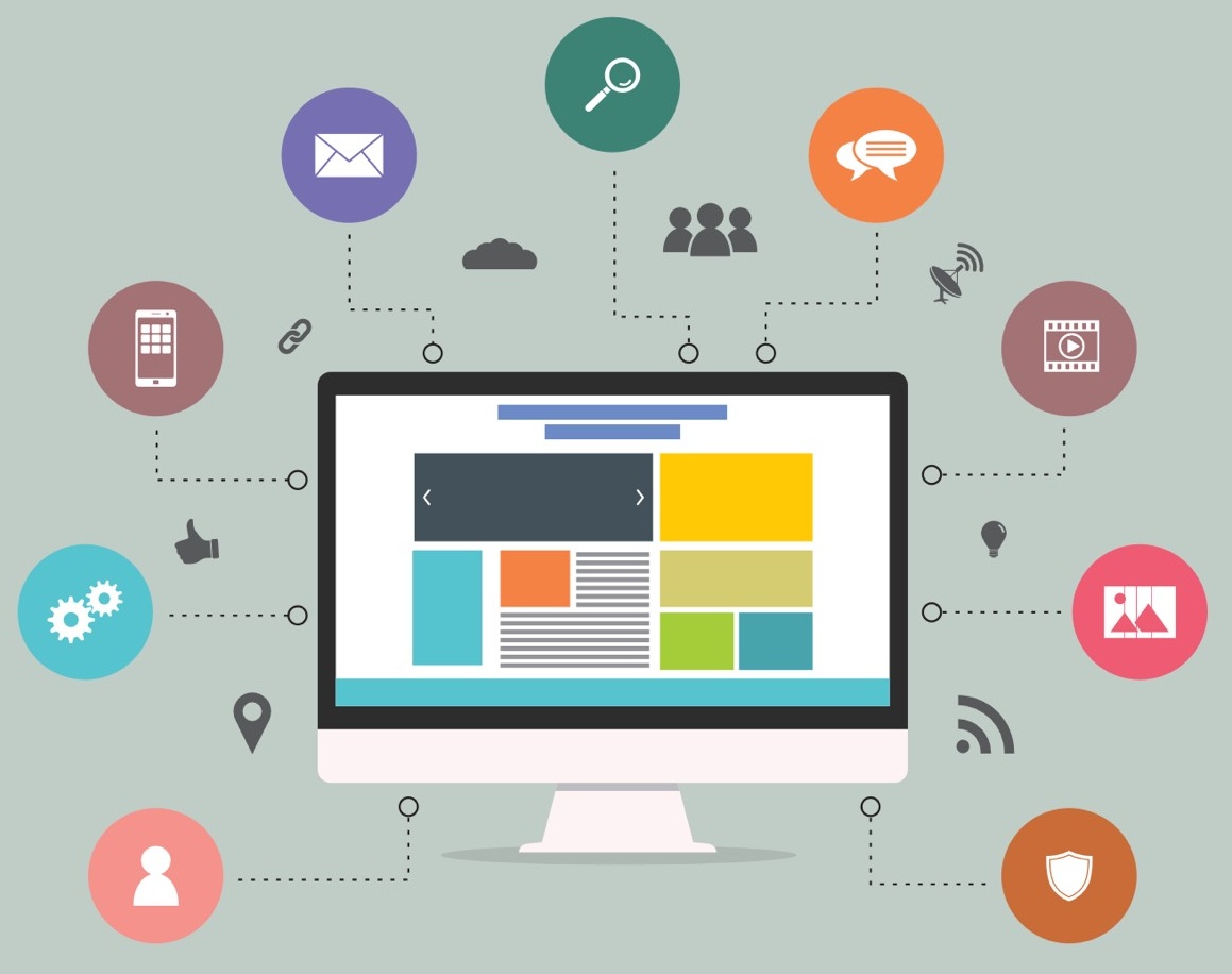
Allow your visitors to make your desired action on their own (e.g. sign up, leave their contact info, download, request a demo). In other words landing page must create the desire to click on the CTA button.
For this purpose landing page should contain :
- single object
- one single action (no links to other pages)
- verbal call to action (e.g. get, sign up, start, download)
User should very clearly understand what exactly he will get after clicking.
2) An effective landing page dispels all doubts and gives a sens of security
Risk is the thing no one user wants to deal with. Important for you is to put yourself in the users’ shoes and to show them, how they can avoid risks by using your product.
- Financial risk. Prove them that the funds they invest will be paid back quickly.
- Risks associated with the use of the product. Help your potential customers to believe they are in need of your product. Tell them more about the product: provide them with instruction, video, talk about FAQ. Do not impose your products or services in a too rough manner. Excessive pressure on the consumer produces an opposite effect. People do not like to be manipulated. Let a person make her own decision – to buy your product or not. You only need to gently push him to a positive decision.
- Competitor risk. Explain them, what advantages you have over your competitors, why do they need choose you among many others like you. Customers should obtain the real benefit of working with you.
3) Effective landing page loads quickly from any device

Check the page download speed. Ideal landing page loads quickly enough. Do not use “heavy” elements and unnecessary graphics. The landing page should be simple. The delay in opening the drop-down menu or by sending data leaves a bad impression.
4) An effective landing page is clear without scrolling

The main advantage of the effective landing page is that a user sees the main information on the first screen. This significantly increases the chance that a user will not close the tap with your page and will decide to purchase.
5) Effective landing page is not possible without an A / B testing
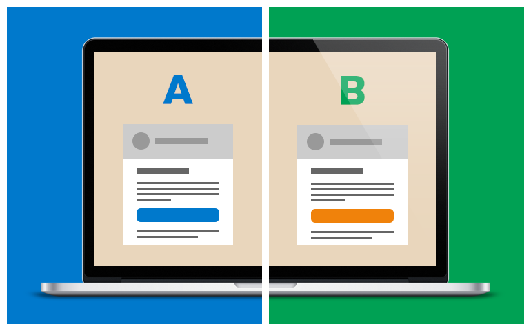
Change the text, move the photos, try to use animated gifs .You should always create at least two alternative versions of the landing page, test them, measure and improve.
When the content is ready, it is time to think about the wrapper…
Affective landing page has a simple design, clear offer and instructions

Design is an integral element of the page. This is not a separate part of the project. External design should match the content and be a perfect form for presenting the information. When you create a landing page, it is desirable to take into account the specifics of the business and the benefits of the company. It is important to consider all elements of the landing page, so the end result looks holistic and winning.


