Advertising is an Art: 8 Reasons Your Banners Don’t Work
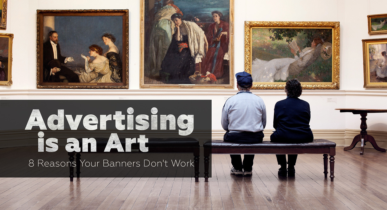
In digital advertising, it’s not enough to get the impressions: you need to impress! Treat your banners like art and getting a click wouldn’t be a problem.
If you want to know, how to make your ads work and what separates them from being a real piece of art, read our top below and make your own masterpiece.
1. You don’t reach your target demographic
When designing display ads it is important to segment your audiences based on demographic data and create text, attracting all sides of the target group. It is also important that your ad is resonating with each group of the target audience. For example, men’s cufflinks may be of interest not only to men, as the main users, but also to women who want to present them as a gift.
2. Ad is not emotional enough
In the world of advertising banners diversity is important to “hook”, to attract and to focus on the attention of a potential customer. Joy, sadness, tears, laugh — that will impress absolutely everyone. According to statistics, such ads are 47% more efficient than conventional advertising posts.
3. No sale — no game
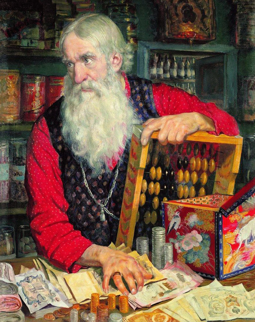
Everyone loves a discount. When a potential buyer feels that he (or she) can hold a bargain, the probability of purchase is very high . Experiment! Try free shipping or 50% discount on some of your goods. Test what is better suited specifically to your business! Try different variations! Look at the reaction of your customers!
4. Too much information

The human eye is unable to perceive too much information at the same time . Clean your banner from excessive information. Keep only what you need! The less information on the banner, the more likely that the necessary information reaches the recipient and assimilates to the full extent . Everything that’s needed:
- One image
- One message
- One call to action
- One brand mark
5. Wrong colors
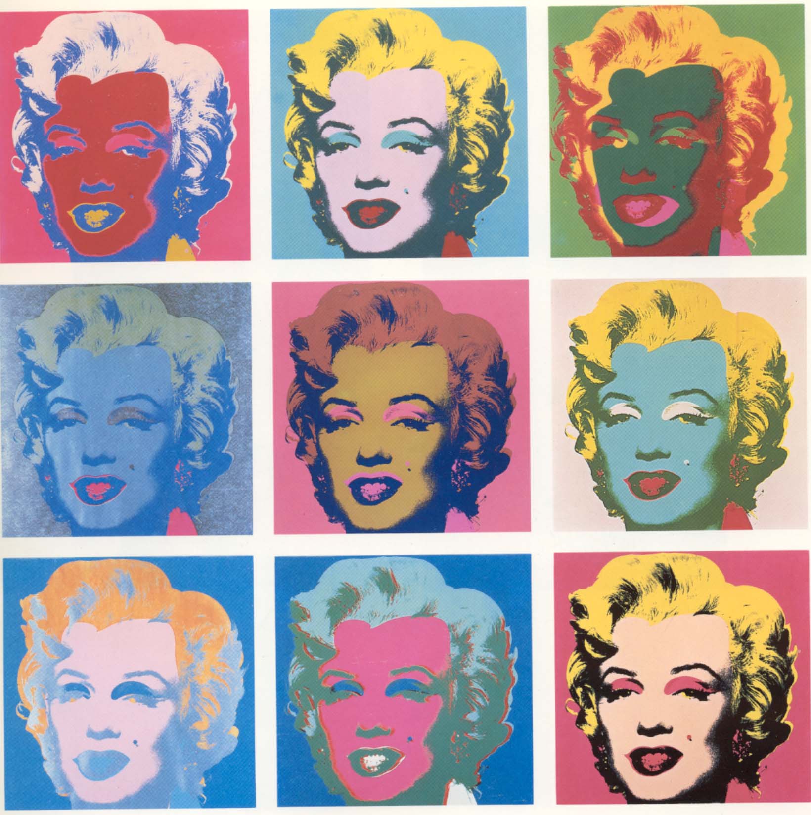
Colors can affect the audience as much as the words. You can improve your banner ad design by using the rights colours in the right way.
Different colors evoke different feelings. For example, red is able to arouse emotions and aggression in particular, while the green one is the color of peace, tranquility, acceptance.
Therefore it is important to choose colors that represent your brand, but also make people feel things that fit with who you are and what your product or service is. It is equally important to create a color scheme as appropriate to your brand so that it was associated solely with him.
6. Weak Call to Action

Test multiple versions of the CTA in order to determine which one suits you best. It is important not only to provide the banner with the information about your product or brand, it is important to stimulate the desire to “click ” on it.
7. There is no story
Try to captivate reader’s attention with the small mini-scenes, depicted on the banner. Your ultimate goal is to sell a product and in order to do it as efficiently as possible, try to tell a story related to the use of this product. Don’t forget, that even the worst story would be more interesting, than the best selling text.
8. Content is not optimized
Your ad files should be formatted properly. Choose the smallest file size possible. The target file size should be somewhere around 150 kb, depending on the size of the ad.
Then make sure to save in a format that works across the web. Common file types for banner ads include PNG and JPG for static displays, and GIF for animated displays. As the popularity of SVG increases, this format is becoming more widely accepted as well.
Conclusion
The main thing you have to understand about creating an ad is that there is no universal formula. This is indeed an art. Best solutions are always found with tests and experiments. You can never truly predict the reaction of your audience.
So don’t miss your chance to be an artist. After your banner is created, advertising is all about numbers and statistics. Carpe diem!


